 +1 315 210 4488
 +91 798 618 8377
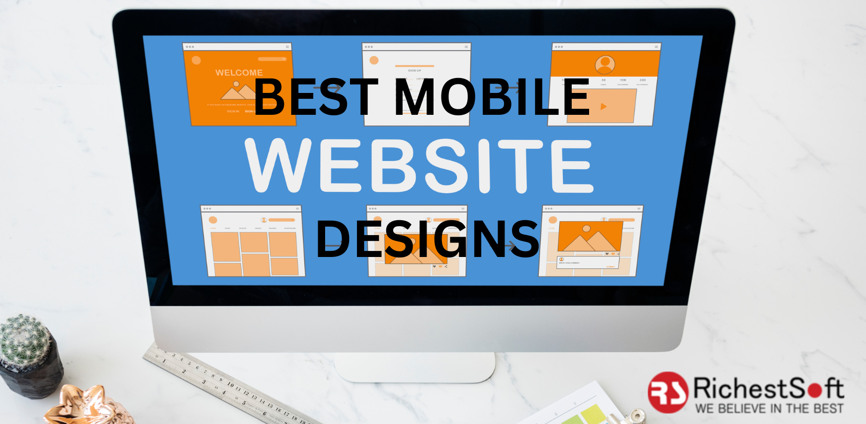
Following Google’s update, responsive design became more of an absolute necessity than a trend. The three-syllable word “responsive” is one that clients regularly keep throwing at web designers. There are several approaches to make your website mobile friendly, including responsive design, a m(dot) version of your website, and an adaptable version, which the majority of you may not be aware of. We will look at each type in depth.
1. Version m(dot)
Making websites mobile-friendly in the beginning required the usage of m(dot) designing. On our mobile devices, we have all seen the writing m(dot)websitename(dot)com. The letter “m” denoted for the website’s mobile version. Facebook and YouTube both created a different version of their website with m(dot) in the prefix rather than the standard http://.
Advantages of m(dot) Design
- Improved webpage load time
- Devices-compatibility
- Rapid access
Drawbacks of m(dot) Design
- Different URL schemes for the same site
- Duplicate content problems
- Hectic CMS work and development
- Not suitable for all devices and resolutions
2. Adaptive Design
Adaptive design is a more current and advanced variation of m(dot) design. In adaptive design, the server assumes responsibility for determining the type of device being used before loading the precise page. There are now three kinds of devices that support adaptive design. And these gadgets are divided into groups based on their screen resolution.
1. A laptop or desktop website
2. A tablet or smartphone website
3. A Mobile Website
Three separate versions of the website are created and placed onto the server in order to make it adaptive for these device kinds.
Advantages of Adaptive Design
- Improved page load time
- Allows you to customize the content based on the user’s device
- No changes to the existing website
Drawbacks of Adaptive Design
- It is not cost efficient to attain
- Complicated design tasks
- Content sharing across devices is not permitted
3. Responsive Design
Out of the three options, responsive is the most recent. You do not need to create multiple versions of the website with responsive design. You can achieve responsiveness with just one website version. The website layout adapts to the device on which it is viewed. m(dot) is rarely used, but the real battle is between Adaptive Design and Responsive Design. There’s really no definite victor here.
Benefits of Responsive Design
- Only one webpage version
- One-URL Structure
- SEO-friendly
- Affordably priced
Drawbacks of Responsive Design
- Because only one website version is used, the page load speed is reduced
- Long scrolling gives rise to users missing several key features
- Images are scaled down rather than resized, which slows page load time
- Some buttons and links become unclickable as they are scaled down. To click or tap, the user must increase the size
The question “Which is the Best Mobile Website Design for Optimization?” clearly does not have a single answer. Both adaptive and responsive websites have advantages and disadvantages. It all simply refers to your needs and priorities.
Consult with RichestSoft web designers to determine which option is best for you. Make an appointment today for the best web design services.
call : +1 718 313 1485
Email : info@richestsoft.com


